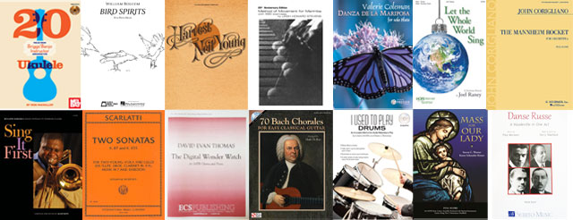
Established in 1964 in honor of the 200th anniversary of the first music engraving in America by the famous silversmith Paul Revere, these awards were initially given as a means of alerting the music industry to the advantages of providing the best possible publication from the viewpoint of engraving, graphic arts and production standards. Today the awards still recognize outstanding examples of graphic design, with an emphasis on usability for orchestras, educators, libraries and individuals.
For the first time ever, both the 2019-2020 and 2020-2021 awards were collected, adjudicated, and presented digitally.
Award Winners
- 2024
- 2023
- 2022
- 2021
- 2019
- 2018
- 2017
- 2016
- 2015
- 2014
- 2013
- 2012
- 2011
- 2010
- 2009
- 2008
- 2007
- 2006
- 2005
- 2004
- 2003
- 2001
- 2000
- 1999
- 1998
- 1997
- 1996
- 1995
- 1994
Touring Schedule
The Paul Revere Award winning publications are available for display at libraries, schools, and other institutions.
If you or your organization is interested in hosting an exhibit, please contact us via the contact page.

2025 Applications will open in March 2025 and be sent to all current members via email.
MPA Member looking for the full guidelines? Check your email or send us a note.
ELIGIBILITY PROCEDURE
All member companies of the MPA are eligible. Any publication originating in the USA and produced for general distribution, sales or rental, through regular channels between April 1, 2024 and May 31, 2025 is eligible, provided it has not been previously submitted.
CRITERIA for NOTESETTING AWARDS
- Notesetting follows conventional rules but allows for innovations and exceptions where they improve the readability of the music
- Notesetting is neither overcrowded nor overspaced, maintaining sufficient white space on the page in relation to the music
- Vertical alignment of staves and systems is maintained, and choice of staff size is appropriate
- Choice of text and music fonts is aesthetically and pragmatically planned
- Cues and other clarifying marks are used to effectively facilitate performance
- Notes are spaced in aesthetic proportion to their duration
- Layout accommodates the need for page turns
- Binding is of sufficient quality
CRITERIA for DESIGN AWARDS
- Originality and conception is valued
- Impact and relevance of art to the musical content will be considered
- Balance of symmetrical and asymmetrical elements
- Harmonious balance between typefaces and styles, design and color
ADDITIONAL CRITERIA for EDUCATIONAL AWARDS
For educational content in engraving & design categories, in addition to the points above:
- Content is appropriate for the intended audience
- Content is well organized, providing the best possible communication to the student(s)
COMMONS MISTAKES TO WATCH OUT FOR
- Bad page turns
- Not enough ink coverage
- Inconsistent note duration
- Missing dynamics, accidentals
- Missing or misusing articulations
- Improper beaming
- Poor binding
- Typos
PUBLICATION CATEGORIES
Design
1A Cover Design
1B Book Design
1C Video & Interactive: Instructional & Educational
Notation
2A Choral Music
2B Classroom & Instructional Method; Lessons, Scales, Theory, Classroom, Workbook
2C Keyboard Music; Piano, Organ, Accordion, Synth
2D Music for Fretted Instruments; Guitar, Ukulele, Banjo, Lute
2E Percussion & Drum; Kit, Hand Drums, Handbells, Marimba
2F Piano/Vocal Music
2G Full & Study Scores, Including Conductor’s Scores
2H Instrumental Solos, with Accompaniment
2I Instrumental Solos, without Accompaniment
2J Chamber Ensemble, Score & Parts (for three or more instruments)
2K Band, Orchestra & Large Ensemble, Score & Parts
2L Non-traditional Notation, Including interactive elements
